- Documentation
- 1 - Start Here
- 2 - Indicators
- 2.1 Future Pivots
- 2.2 - WaveTrend
- 3 - Tools

The Distance Algorithm Visualization (DAV) Tool
In Justin Dehorty's original YouTube video entitled "Lorentzian Classification: Machine Learning Driven TradingView Indicator", at the 3:42 timestamp, he introduced a tool he used to help the audience visualize how Lorentzian distance measurement differed from Euclidian distance measurement.
Over the past year, we have received several inquiries about the tool. We've resisted making it available until now because it really has nothing to do with Trading Analysis, per se. Its value is more as an educatioinal tool, for those interested in understanding how Lorenztian distance measurement works.
We've made this tool available to our Server Boosters as another "perk" to show our appreciation for their boosting.
Note: The following documentation is not full coverage of DAV. Rather, we've touched on the minimum aspects necessary to get started with the tool in a sort of "explore and discover" way.
The Main Screen
DAV is a 3D visualization tool built on three.js. Its interface is broken into 2 parts:
- The UI Controls across the top of the screen.
- The Rendering Canvas that fills the rest of the screen below the UI Controls.
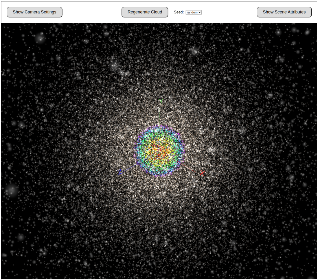
Randomized Point Cloud
The initial 3D view looks like a rainbow-colored ball in the middle of a blizzard. You are looking at 3 things there:
- The white stuff and the rainbow-colored stuff collectively make up a point cloud generated with a random spherical (and Gaussian) distribution, centered about an origin.
- A subset of those points are rainbow colored to represent their distance away from the origin (red being the closest, indigo being the farthest). In this initial view, distance is calculated according to the Euclidian distance formula.
- Although they are difficult to see in the "blizzard" there are X,Y,Z axes, in classic Cartesian coordinate style.
SpaceTime vs. PriceTime
The reason we chose this as DAV's visualization style is that most people can relate intuitively to a 3D representation of SpaceTime. We wanted to tap into that intuition to describe how Lorentzian measurement provides benefits over Euclidian measurement in what Justin dubbed "PriceTime". In this analogy, the points of the cloud are analogous to datapoints in a time series representing price action of some financial instrument.
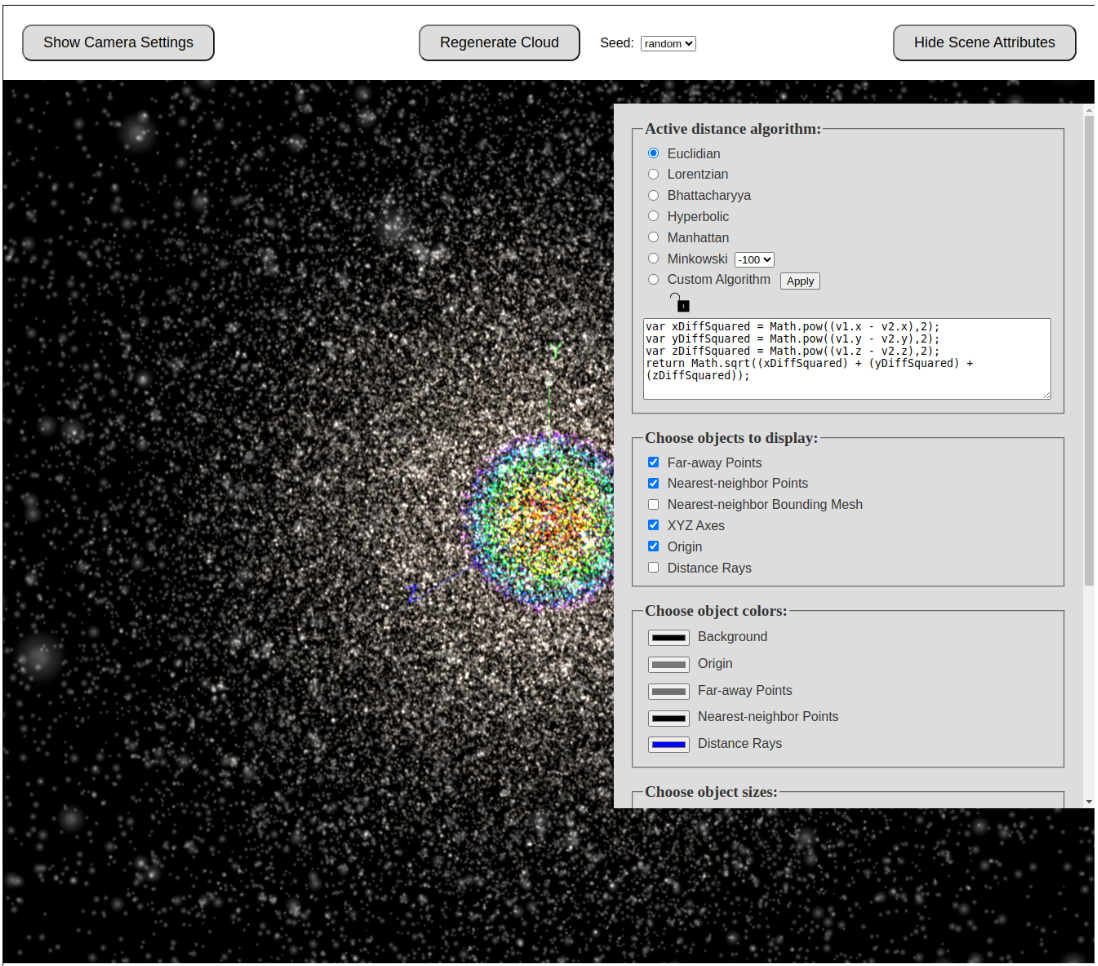
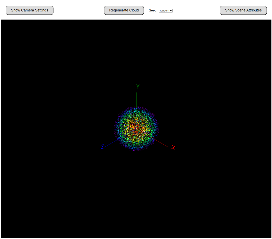
Remove the "Far-away" Points
The first thing you'll want to do in DAV is remove the scattered white matter, which we call "Far-away" points. To do that, we need to click the "Show Scene Attributes" button at the upper right of the screen. That brings up this form in the UI:
After we click-off the toggle for Far-away points and hide the scene attributes, the display now looks like this:
Zoom-in on "Nearest Neighbor" Points
Now we can zoom in (using a mouse-wheel or the equivalent "finger pinching" gestures on a tablet, etc.) to get a closer view of what we call the "Nearest Neighbor" points and the axes.
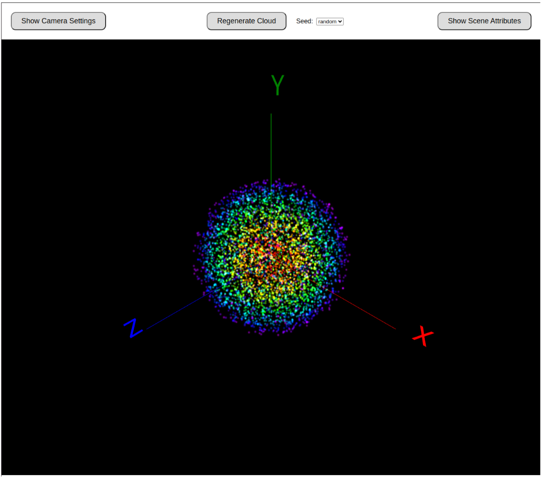
Note: Clicking and dragging on the screen (or the equivalent swipes if you are not using a mouse) is useful for rotating the view.
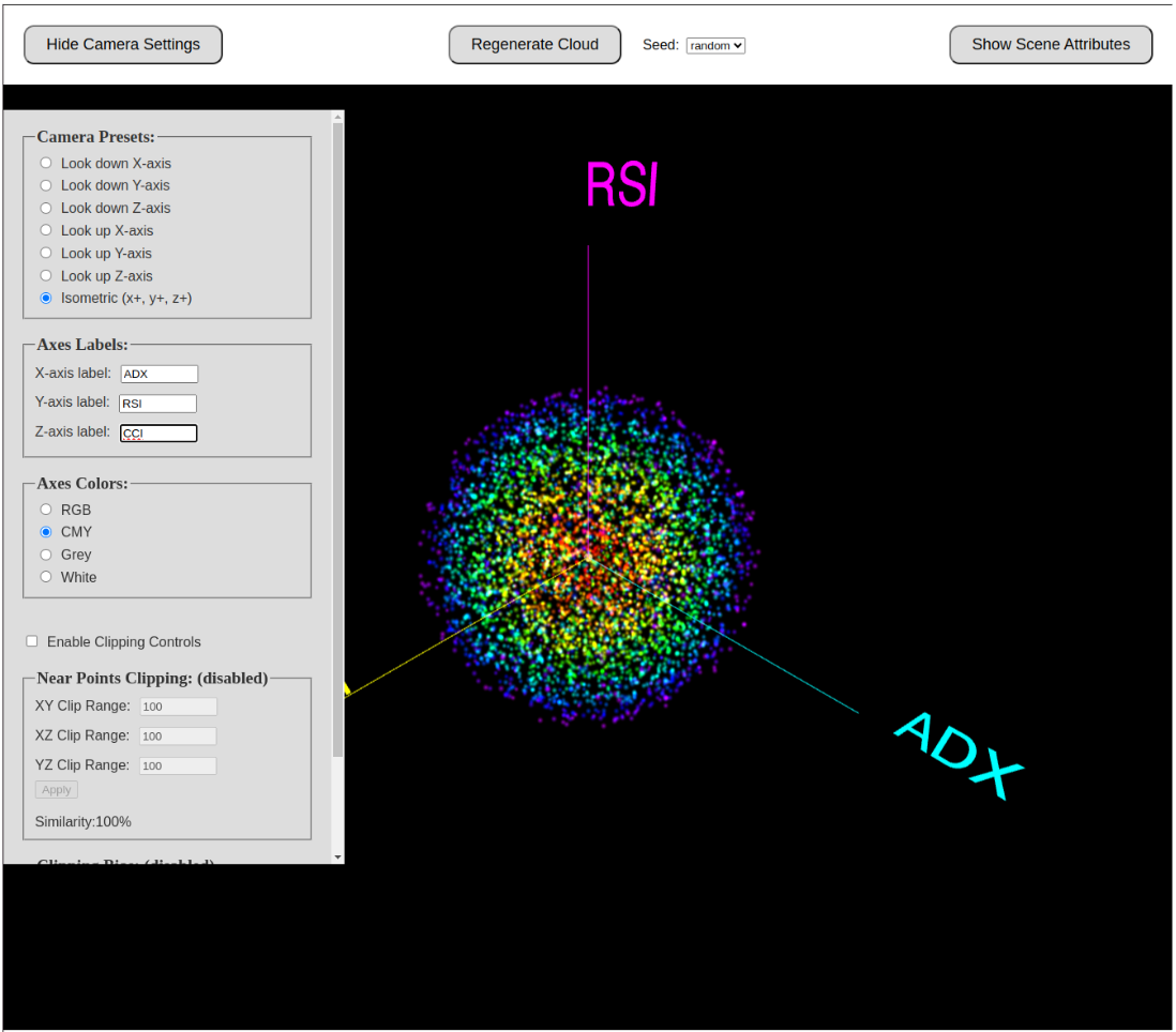
Changing the Axis Labels
We can make the anaology between SpaceTime and PriceTime a little easier to understand if we change the 3 axis labels to reflect "features" in a Trading Analysis context. Let's change the axes to RSI, CCI and ADX (as Justin did in his video). To do that, we toggle on the Camera Settings form on the upper left. We'll also change the axis colors from RGB to CMY.
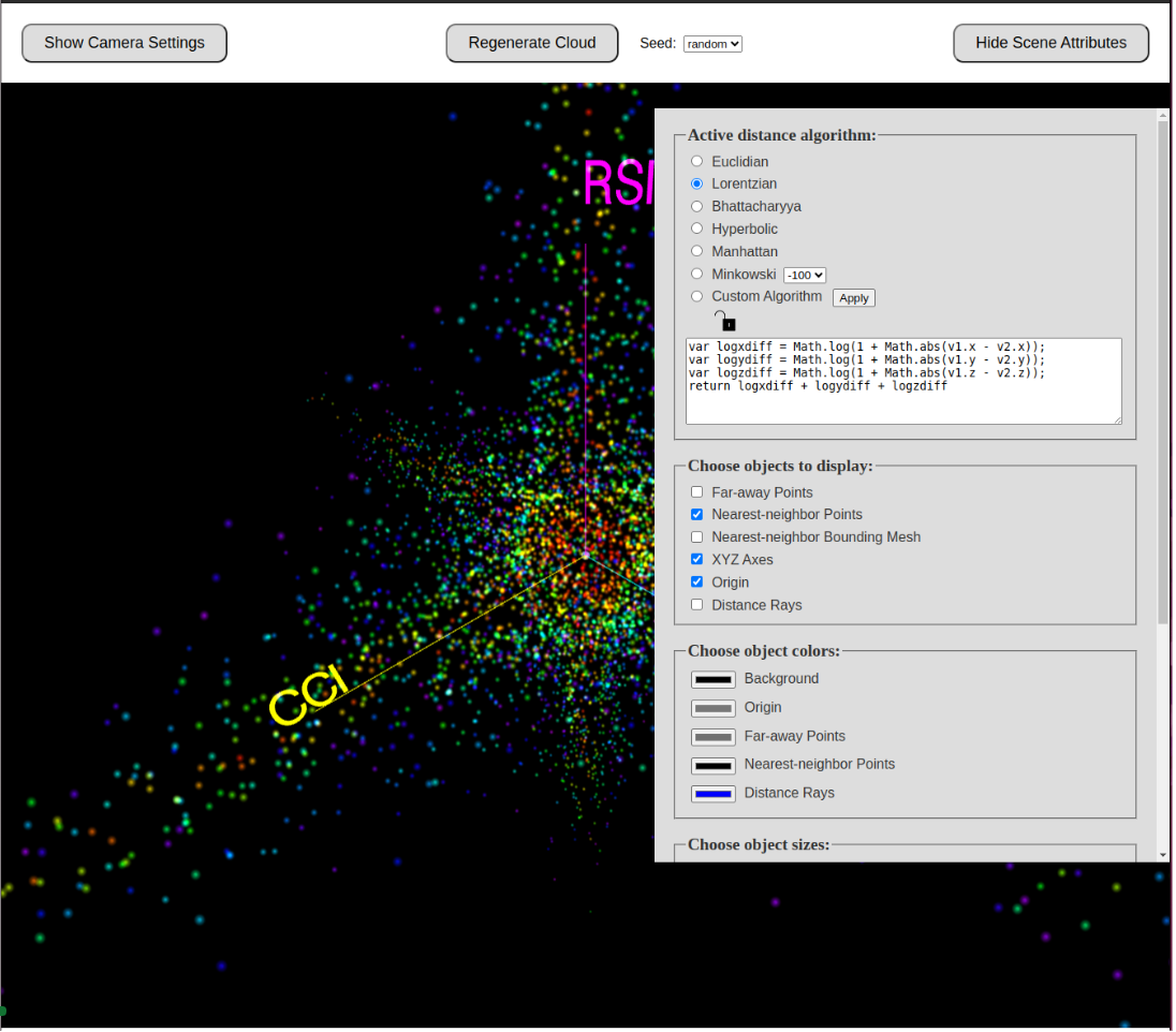
Using Lorentzian Classification to Find a New Set of Nearest Neigbors
Now we will activate the Lorentzian Distance Measurement formula in order to select a new set of "Nearest Neighbor" points to the origin. As we select it, we can see that the shape of our Nearest Neighbors selection changes, because Lorentzian has found a different set of points to be "closest" to the origin. The analogy in a trading indicator context is that Lorentzian distance calculations will select a different set of historical nearest neighbors as "similar" to the current state of price action.
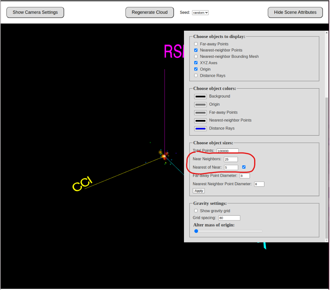
The Nearest of the Near
If you've watched Justin's video, you may remember him referring to a small number of points as "casting their vote" to predict where price action is headed. In DAV, to trim down the "Nearest Neighbors" count to a specifc size, you have have to scroll down in the Scene Attributes panel until you see the "Choose object sizes" grouping. Here you can change the number of nearest neighbors that you want to display. You can also use the "Nearest of the Near" field to emphasize a subset of the points.
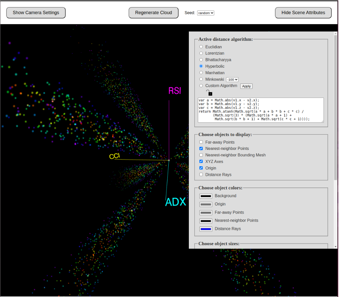
Other Distance Formulas
As you can see in the next image, there are a variety of distance formulas to choose from in DAV. Here I have the Hyperbolic distance formula selected. You can even try typing in your own custom formula (in Javascript syntax).
Summary
In summary, the Distance Algorithm Visualization (DAV) tool is an educational resource designed to illustrate the distinctions between Lorentzian, Euclidian, and other distance formulas. Exclusively available to our Discord Server Boosters, DAV complements the insights shared in Justin Dehorty's video by offering a hands-on experience with the Lorentzian Classification concept, helping to draw an analogy between SpaceTime and "PriceTime". Its 3D visualization capabilities allow users to directly observe and manipulate how different distance formulas impact data point analysis, providing a clearer understanding of the Lorentzian Classification algorithm’s benefits for financial analysis. We encourage our Server Boosters to explore DAV in conjunction with Justin's video to grasp the full potential of Lorentzian distance calculations in enhancing the prediction of price action trends based on historical data points.